Thursday, December 12, 2013

Group Project: Dylan's Candy Bar Game - Second Iteration

For the second iteration of our project we observed how the class interacted with the game playing it. We were satisfied with most of it, so we decided our second iteration would be an attempt to relate our project to the concept of Avatar. To do so, we decided to create characters inspired by each of the member’s of the group to be the horses of the game. As the game is based on a candy store, we found in our personalities what related us to a specific candy. The results were characters based on Cookies, Ice-cream, Candy and Chocolate. 
As the change in the horses was not enough of a change for a second iteration, we decided to also work with the avatar concept creating posters that would be ads of the game and have our characters on it. This idea would not only advertise our project, as our first idea was to make a game that could be sold on the store, but also strength the concept of the characters, giving more personality to the ad and also to the game. The horses of the game could also make people playing the game identify and “be” their favorite candies while playing it.
We hope to bring to the players of the game the same excitement and enlightenment we felt the moment we stepped into the store and our eyes were fulfilled with all the unusual design and products ideas the store provides. The tools we used to provoke this feelings are the use of colors, the images of products sold in the store and the gummy bear candies as the horses of the game (so we could provide the experience of playing with actual candy and resisting the temptation of not eating them until you get to the end of the game).
This is the link for our group presentation on Prezi:
http://prezi.com/btxj2vywyl9_/?utm_campaign=share&utm_medium=copy&rc=ex0share
our characters-avatars are bellow:


posters...


and this are the results of our final presentation in class!


Sunday, November 24, 2013

The Dylan's Candybar Game

We were asked in class to, in our group, choose a place we thought was interesting and create either a game, board game, booklet or pec elf art that game the spectators of the piece the experience of being in the place we chose.

I  our group, we decided to create a game board of the Dylan's Candybar store.
Inspired by the classic board game called candy land and by the information and notes we collected when visiting the store, we created a game, that, divided in sections, showed a bit of the dynamic of the Dylan's store, making the player of our game aware of the products, colors, advertisement and excitement you can feel as soon as you enter the store.

We wanted the game to be something possible to be commercialized later, and that's the reason why we made everything digital and printed out.

The pictures of the final game are bellow:
this is the box we made for the game
when you open the box it looks like this
the horses, the dices and the beginning cards

This is the game settled in the table while we were playing in class

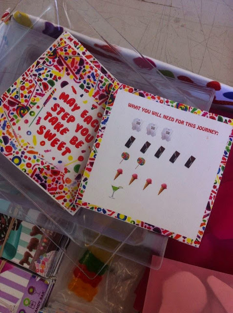
at the beginning of the game each player receives a card telling them what they need to "buy" in order to finish the game

this are the cards that give you directions on what you are allowed to buy/ what you may loose during the game. If you want to take a closer look at the cards...
the chocolate section cards
the candy section cards
the drinks section cards
the apparel section cards
the ice-cream section cards


the results!

Monday, November 18, 2013

What's in a place - Group Assignment - Part 4 (finally!)

After all the research, group work and presentation of the last 3 weeks, we got to the last stage of our project which was find a solution and somehow execute it.
As we could not actually have out idea done because of the price the red stripes would cost and because of installation and permission problems, we decided to make a model of how the Cafe 55 would look like in case we actually installed the red stripes.

We used foam board, colored papers, red tape, pins, drawings and paint to try to get to model which is closer as possible to the reality.


Hope you like it!

Saturday, October 26, 2013

What's in a place - Group Assignment - Part 3

After interviewing people we got to understand the place better, and therefore we needed to decide a way to make an intervention at the place.

After collecting all the material and proposing an intervention or solution toa problem we had to present in class our project.

The boards we made for the presentation are bellow: (the other group presented our work to the class and we presented theirs. I guess this was a speaking training exercise, as we are an ESL class).


We realized throughout our observations and interviews that people don;t realize the space at the cafeteria and do not have opinions about ir. They usually just go there to eat. We decided to create predicts that visually made people notice the cafeteria space and become involved to it.

I wrote at my sketchbook about the cafeteria:

If I could describe the cafeteria briefly I would say it is passive and convenient.
People stand there, united as members of the New School because it is convenient: either the location (it is inside one of the university buildings), the fact that they have a meal plan, or the fact that there is  fast place to get food in between classes.
Alone or in small groups. the cafeteria represents only a small fraction of time of student's days; a fast stop to break the busy class schedule. No more than an hour, no more than a snack. People hop on and off of the blue, cold space with its clean, basic design. Not special, but extremely acceptable. Again, convenience,
Mostly freshmen students, from all majors and countries. The lure of convenience has the power to make them all eat the same average deli american food in a neutral, almost boring, space. o one loves it or hates it. They do not belong there, nor feel the power or need to change it. It's a fraction of each one's life and time, a half0-the-way space. The cafeteria becomes a neutral environment on student;s life, and play the smallest role on their significant day. The cafeteria is not a place; it is simply a routine.


What's in a place - Group Assignment - Part 2

After collecting information at the Cafe 55 we planned some questions we would ask to people in an interview we were having the next week. The questions we decided to ask were:

1. Do you have a meal plan at the cafeteria? Is this one reason why you come here?
2. What times of the day do you eat here?
3. How do you rate the food in quality, variety and price?
4. How often do you come to the cafeteria?
5. Which foods do you usually eat?
6. Is there anything in this space that bothers you/ that you would like to change?

(of course we also added questions depending on each person's answer but mainly we could write this results objectively.

From the interviews we got to this results:

1. Meal Plan
Yes: 8
No: 3

2. Time of the day
Morning/Breakfast: 1
Lunch: 11
Dinner: 0

3. Food rating (in average)
Quality: 6.3
Variety: 6.29
Price: 5

4. How often they go to the cafeteria
1-2/week: 3
3-4/week: 3
5-6/week: 2
Everyday: 3

5. Food they eat often
Salad: 3
Yogurt: 3
Hot meal: 2
Flat bread: 2
Soup: 1
Sushi: 2


6. What they want to fix 
Not enough seats/tables:
Better Tables
Food changes
Space (Too small, etc)

We decided to make a graph to represent our results and visualize them better.

some of the pictures we took during the interview are bellow:


What's in a Place - group assignment - part 1

We started a new assignment two weeks ago, which is related to the analysis on a space. During the class we went to a place of the New School and observed the movement and make notes for half an hour. After coming back to class and being divided in groups, we discussed the observations we made and were asked to pick a new place to work on more observations.

My group decided to choose the Cafe 55, cafeteria of the Arnold Hall building at the New School. For the first time of the project we were asked to go to the place and make precise observations on it. We made drawings, took pictures, videos, wrote about the space and made a floor plan.

This was the first part of the project and the information we collected is bellow:


pictures:


Drawings:


 the floor plan:


And the observations...

Textures of the Cafeteria:
Table: has a lot of scratches from x-acto knives (I guess). Are white and plain.
Floor: Plain, rubber, gray floor
Surfaces at the cafeteria are usually plain. I believe this is because it is easier to clean it this way, as it's a food place that needs to be always clean. ALso, plain surfaces without patterns make the place look bigger, simple and kind of "modern". The colors of the cafeteria are blue and gray, which is a weird choice as this colors are not psychological related to make us hungry (as red and yellow, which would be more attractive colors). Also, the cafeteria looks for me kind of crowded and overwhelming and it's not the kind of place I would possibly choose as a pleasant place to seat and eat. I'd rather go somewhere else, specially when it is crowded.

Display of the cafeteria:
The way the cafeteria is displayed also forces the interaction between people (as the tables are so close to each other). WHen you are with a group of friends this can be pleasant, as you can seat together and it on a familiar environment. WHen you are alone, though, it is hard to fin a comfortable spot to sit down and eat peacefully when the cafeteria is crowded. When it is empty, mostly between lunch and dinner, it is cozier to sit on the tables (that become kind of communal as there are not a lot of groups of people) and eat alone reading something of texting on your phone.

The food:
the food display at the cafeteria is interesting: foods are placed in a linear line, starting with yogurt and fruit self service, going to warm food ordered and then ending with a refrigerator. You pick your food and pay it at the cashier which is located between the hot food and the refrigerator, right next to the place where most eating tables are located


Observation of Arnold Hall Cafeteria (11:45am - 1:00pm)
- People waiting in line to order food and at the cashier
- Pizza, salad, yogurt, hot meal, drinks, baked good, etc
- Especially long line for pizza and flat bread, not as long for salad and hot meal
- People eating alone, and people with their friends, usually in groups of 2, 3 or 4.
- People alone=> with books, sheet of paper, on a computer, on their phone or listening to music.
- People wandering around looking for a place to sit.
- Release of stress
- The atmosphere is not as tensed up
- People are sitting and having lunch but they still look busy (they are usually on a task and if not, their eyes are so busy looking around etc)
- Unlike those eating alone, who usually leave right after they are done with the last bit of food, people in a group linger around and socialize.
- There is a pattern in movement
= If two groups of people leave, 2 come
= There's always some spots for people coming in
(maybe this is the reason why it doesn't get overcrowded)
- People eating on the balcony (looking out the window)
- People come and join. join their friends.
- some are SO FOCUSED on their food
- People coming up from the computer lab
- People have so much carrying around with them, ex sketchbooks
= Bumping into people
- Why would anyone buy an already made wrap/salad when they can have their own salad/wrap made...?
- People have different ways of mixing their salad (shaking/stiring)
^ INTERESTING WOAHHH
- Eating in a group = gradually gets louder
- Very good ventilation
- High ceiling => makes the space look more open
- There are phases (when it gets crowded and when it empties)
- Table => a lot of scratches
- A LOT of in and out (alternates within 7-8 minutes)
- Atmosphere => very relaxed but little bit of tension due to the business. Not as comfortable, people eat and go. come eat and go
- Seems like a place where people can linger, socialize but still there is rapid in and outs, "come and go"s
- Just a place to drop by, not a final destination => a passby place... (??)
- The space between the tables => too narrow??
- VERY BUSY